
Overview
NotBad is a Markdown writer for Windows, macOS, and Linux. You write in plain .md files, and the app hides the Markdown while you type, so headings look like headings and bold looks bold. Everything else stays out of the way until you ask for it.
I did the whole thing: the product framing, the interaction design, the visual system, and the Flutter code that ships it. That matters for this story: several of the decisions below were only possible because the person drawing the screen was also the person deciding how the text engine works.
Version 1.0 shipped in September 2026. In the weeks since, it has picked up code highlighting, a daily writing goal, an E-Ink mode, tables, and the ability to type in Telugu and Hindi, all without making the app any louder.
The Problem: Plumbing Between Writer and Words
Markdown editors force a choice. Either you stare at raw syntax (asterisks, hashes, brackets) while you write, or you split the screen with a preview pane and keep glancing sideways. Both put plumbing between the writer and the words.
There is a better model: show the Markdown as what it means, in place, and keep the file plain underneath. Trace did this beautifully, but only on the Mac. Writers on Windows and Linux had nothing like it.
So the question I started with was: can the in-place Markdown experience exist on every desktop, and still feel as light and calm as the idea deserves?
Who It's For, and What It Leaves Out
I designed for one kind of person: someone who writes prose (notes, essays, documentation) and who:
- keeps their writing in plain .md files, with no library, no lock-in, and no cloud,
- wants the piece to look finished while they're still writing it,
- works mostly from the keyboard, but shouldn't be punished for reaching for the mouse.
That gave the design four goals:
- Words first. The resting state of the app is text on paper.
- Instant and light. Open and type in about a second, with nothing heavy in the way.
- Same everywhere. Identical behavior on Windows, macOS, and Linux.
- Trustworthy. An app for words must never lose them.
Just as important was the list of things I decided not to build: preview panes, split views, a plugin manager, an AI assistant, and a formatting toolbar with forty buttons. Each of those is a reasonable feature in some other app. Here, every one of them would have put something between the writer and the text. Writing the list down early kept later arguments short. If a request landed on it, the answer was already decided.
Five Principles
Five principles settled arguments before they started:
- Conceal, don't remove. Syntax marks stay in the file; only the view hides them. The document on disk is always plain Markdown, and the UI never owns the data.
- Everything within reach, nothing in view. Chrome appears on intent (mouse movement, a shortcut) and recedes while you write.
- Keyboard-first, mouse-forgiven. Every action has a shortcut and lives in a fuzzy command palette. A floating toolbar and quiet title-bar icons cover people who prefer the mouse.
- Predictability beats magic. Hidden marks reappear where you're editing, external file changes ask before overwriting anything, and what you see always maps to the file.
- One theme, done well. No theme gallery: one warm-paper light and one neutral dark appearance, six accent colors, three line heights. Fewer options meant each one could be tuned properly.
Key Decision: Native, Not a Browser in a Box
The usual way to bring an editor like Trace to other platforms is to put a web-based editor inside a desktop shell. Most cross-platform editors are built that way, and it's why most of them need 100 MB or more and a few seconds to start. Desktop web views also behave differently on each platform, and they're weakest on Linux, exactly where reach mattered. For a tool whose whole promise is calm, that was the wrong trade.
So the editor is built natively in Flutter: about 3,500 lines of Dart doing what the original needs roughly 28,000 lines of Swift and 14,600 of TypeScript for. Each keystroke restyles only the line it touched, so long documents stay as fast as short ones.
The writer never sees any of that. What they get is about one second from launch to typing, a 15.2 MB Windows installer, and the same behavior on every desktop. Installing follows the same thinking: on Windows, NotBad installs per user without asking for admin rights, because writers install their own tools. Linux gets a tarball and a Snap package, and macOS a zipped app, all built automatically from the same code.
Key Decision: Hide the Syntax, Keep the Text
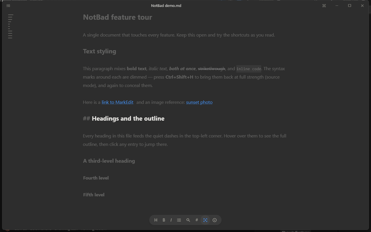
The core interaction is concealment. Markdown marks fade away, and headings, emphasis, and links simply look like what they are.
There were two ways to build it. One was a custom layout engine that removes the marks from the screen entirely. The other was to keep every character exactly where it is and paint the marks transparent at almost zero width. I chose the second. Because the marks still exist at their real positions, selection, undo, find, and caret movement always line up with the file on disk. A custom engine would have given me more control, but each of those behaviors would have needed its own translation between what you see and what gets saved, and every translation is a place for words to go missing.
Fully hidden marks have a cost too: you end up deleting characters you can't see. So the line you're editing reveals its marks, dimmed, while the rest of the document stays clean.
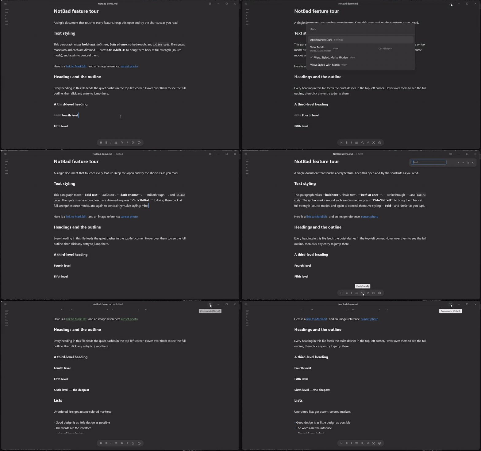
I borrowed this caret-line reveal from Obsidian, because it's the best answer I found for editing honestly in a concealed view. The trade-off is that the active line shifts slightly as marks appear and disappear. I accepted it, and gave people who dislike it a way out: three view modes, one shortcut apart (Ctrl+Shift+H): marks hidden, marks visible, and plain source.
Some marks never hide, even in the default view: list bullets, checkboxes, blockquote bars, and horizontal rules. They are part of the content, so they stay.
Key Decision: Chrome That Appears on Intent
If the words are the interface, anything else on screen needs a reason to be there. I went through every piece of standard window furniture and asked what it was for.
The title bar. The system title bar is the biggest band of non-content in any window, so it went. In its place is a 36px transparent strip that fades into the page, so scrolled text dissolves under it instead of hitting a hard edge. It holds the document name with a soft "Edited" marker, a quiet sidebar toggle, a button that opens the command palette for mouse users, and the window controls. On macOS the native traffic lights stay.
The toolbar. A floating pill at the bottom holds the eight actions prose actually needs: heading, bold, italic, list, find, view mode, focus mode, and statistics. Where a letter is the clearest icon (H, B, I), it uses the letter. The pill fades out the moment you start typing, because your hands are on the keyboard and the mouse controls are noise, and it comes back as soon as you move the mouse. That one 250ms fade does more for the quiet feel than any color choice.
The word count. It lives behind the ⓘ button instead of sitting on screen. A live counter in the corner nags; a count you ask for informs.
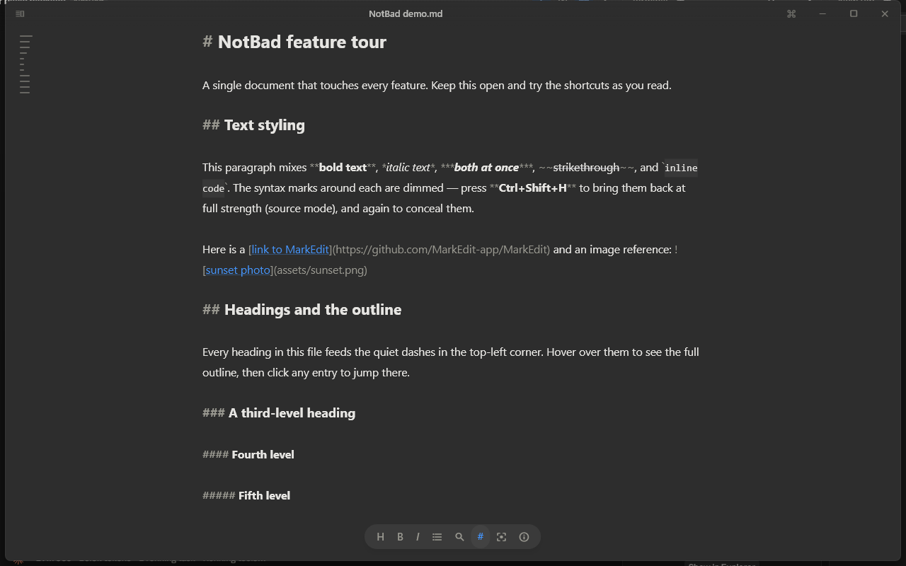
The outline. A table of contents lives as faint dashes in the top-left corner, one per heading, with length showing depth. Hover and they open into a clickable outline. You can ignore them for hours.
The file sidebar. Files have no icons and no extensions, so it reads as a list of your writing ("Reading list") instead of a file manager ("Reading list.md"). Folders keep their chevrons because you can open them. The sidebar is fully keyboard-driven and refreshes itself when files change on disk.
Find. The find bar docks in the top-right corner instead of opening as a dialog, because you need to see the text while you search it.
Iterating on Feedback: The Command Palette
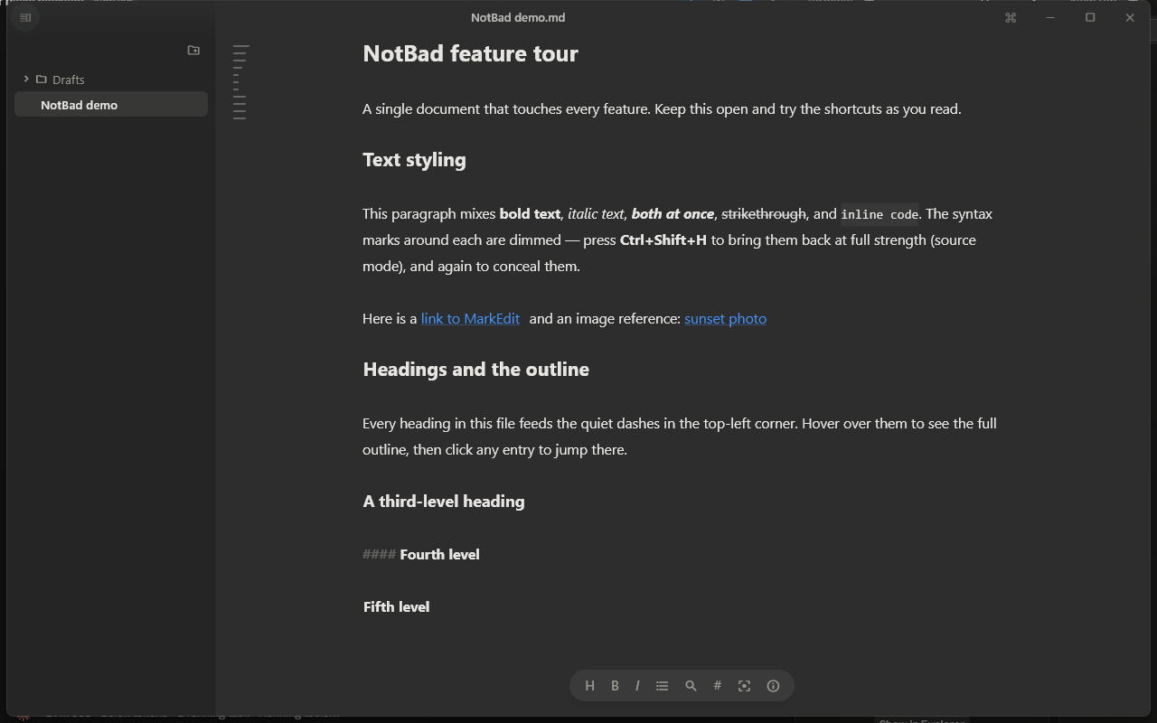
The command palette (Ctrl+K) is the app's whole surface area in one searchable list. It started as a flat list. As features grew it reached about 30 rows, and the feedback was blunt: "it is getting long and too complex."
I considered two other fixes first. A settings window would have shortened the list, but it would also have added a second place to look and a big panel of controls, which works against everything else in the app. Splitting the list into labeled sections would have helped scanning, but the list would have stayed just as long.
The redesign splits browsing from searching. Browsing shows about 13 curated rows, with settings grouped into nested pickers (View Mode…, Settings… → Appearance…, Accent Color…, Line Height…). Each parent row shows its current value underneath, so you know the state without opening it. Searching still reaches everything: nested options stay findable from the top level, so typing "dark" switches the appearance in two keystrokes.
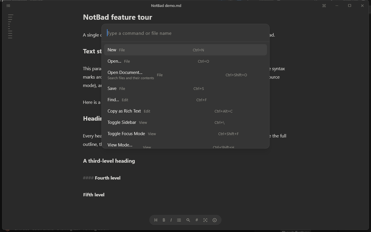
Accent colors are picked from real swatches, so you choose the color you see instead of its name. The nested structure also turned out to be the right home for features I hadn't planned yet, which I come back to below.
The Visual System
Every color, size, and motion in the app comes from one set of tokens, defined in one file.
Surfaces: the light theme is warm paper (#F7F6F3) instead of pure white, so the page feels inviting to write on. Dark is a neutral warm #2D2D2D, with the sidebar one step darker in both.
Accent with meaning: six accents, each tuned separately for light and dark: Amber, Crimson, Fern, Teal, Azure (the default), and Graphite. A blue that reads well on paper is hard to see on dark gray, so each one has two values. The accent colors exactly five things: caret, selection, links, list markers, and active toolbar states. Everything else is grayscale, so color always means something.
Type built for long reading: the system UI face at 15.5px with a generous 1.85 line height (Tight, Normal, and Relaxed presets), headings scaled ×1.6 / ×1.35 / ×1.15, and extra space on blank lines so paragraphs breathe without fake margins.
Motion as acknowledgement: the palette opens in 140ms with a gentle scale-fade, the sidebar slides in over 220ms, and the toolbar fades in over 250ms, all with ease-out. Nothing bounces. Every animation answers one question, "did that register?", in under a quarter of a second.
Designing for Trust
Losing writing is the one unforgivable failure, so I designed trust as deliberately as the visuals. I mapped every path a document can take, from launch to close, and gave each one a promise:
- Pick up where you left off: relaunching reopens your last document at the same spot.
- Saved without thinking: autosave every 30 seconds and whenever you switch away.
- Untitled isn't unsafe: unsaved drafts survive a crash and come back on the next launch.
- No silent overwrites: if the file changes elsewhere (sync, git, another editor), NotBad reloads quietly when you have no edits, and when you do, asks whether to Keep My Version or Reload From Disk.
- One window per document: opening a file hands it to the running app instead of spawning a confusing twin.
Plus the invisible courtesies: line endings preserved exactly as each file had them, and a cursor that never drifts out of sync with the text.
Small Defaults That Add Up
Most of the time in a writing app is spent typing, so the small behaviors matter more than the big screens:
- Enter continues a list: bullets carry on, numbers count up, and checkbox lists get a fresh box. Enter on an empty item ends the list.
- Ctrl+B or Ctrl+I with nothing selected wraps the word under the caret, which is what you want nine times out of ten.
- Typing a bracket or backtick closes it for you, and typing the closing half skips over the one that's already there.
- Click a checkbox to tick it, and Ctrl+click a link to open it.
Focus mode dims everything except the paragraph you're in, and typewriter scrolling keeps the caret vertically centered. The dimming works on paragraphs instead of lines, because a sentence needs its neighbors to make sense.
Each of these removes a tiny bit of friction. Repeated a few hundred times a session, that friction is the difference between a tool you put up with and one you enjoy using.
After Launch: New Features, Same Quiet
The updates after 1.0 were a test of the system: could new features land without making the app louder?
Code highlighting. Code blocks now color their keywords, strings, and comments, using a small tokenizer written in Dart and colors drawn from the same palette as everything else.
A daily writing goal. You can set a word target for the day. Progress shows as a small ring inside the statistics popover, and on the toolbar only once you've set a goal. It follows the same rule as the word count: there when you look for it, quiet otherwise.
E-Ink mode. A pure black-and-white preset with crisp hairlines, for E-Ink monitors and anyone who wants maximum contrast.
Git status in the sidebar. If your writing folder is a Git repository, files show a faint dot when they're modified and a plus when they're new.
Tables. Markdown tables render as an aligned grid with bold headers, and NotBad can line the columns up for you.
Writing in Telugu and Hindi. The 1.0 design document listed "English only" under design debt, with a note that an app about words owes its users their languages. NotBad now has Telugu input in three layouts (phonetic, InScript, and Anu Script) plus phonetic Hindi. In phonetic mode, typing "telugu" gives you తెలుగు, converted as you type.
None of it needed a new screen. Ctrl+M switches between English and your Indian language, and a small badge on the toolbar shows which one is active. The full list lives in the palette as Input Language…, built exactly like the other nested pickers. A reference chart covers the Anu Script keyboard, and exported HTML and PDF files load Telugu fonts, so the export looks like what you wrote.
Showing It: A Film Made From the Real App
A quiet app is hard to sell with screenshots. A still frame of NotBad is mostly an empty page, and the whole point is what happens while you type: marks fading, chrome stepping aside, the page staying calm. So the launch needed a film.
The first films were built from an HTML recreation of the interface, animated frame by frame in a headless browser. They looked right, but every one of them was a drawing of NotBad, and a drawing drifts from the product the moment the product changes. For an app whose promise is honesty about your text, showing a mock-up felt wrong.
So the final film is captured from the real app. A test harness runs the actual editor screen offscreen under a fake clock, types into it, presses the real shortcuts, and saves each frame, about 900 of them at 2400×1500. Nothing on screen is staged: the marks that dissolve are the editor's own concealment, and the sidebar is the real sidebar.
The sound follows the same restraint as the interface. The edit is cut to a short voiceover over a soft felt-piano bed, the music ducks under each line, and quiet clicks land on the captured keystroke times, so what you hear is the writing itself. Because the footage comes from the app, re-shooting the film after an update is one command, not a redesign.
Outcomes
- About 1 second from cold start to typing.
- 15.2 MB Windows installer; 18 to 27 MB downloads on Linux and macOS.
- Three desktops, one design: built and tested automatically on every change, with regression tests guarding the sharp edges (view modes, line endings, list continuation, search, tables, and the Telugu engine).
- Telugu and Hindi input within weeks of launch, without adding a single screen.
And the one that can't be measured: the resting state of the app is a piece of paper with your words on it. That was the whole brief.
What This Project Taught Me
Write down what you won't build. The list of non-goals did more design work than any mockup. It turned dozens of future debates into quick decisions.
Fix the structure behind the complaint. "Too long and too complex" could have been patched with smaller type and section headers. The real fix was separating browsing from searching, and that same structure later made room for language input without a redesign.
Knowing the engine changes the design. Painting marks transparent instead of removing them looks like an engineering detail, but it's the reason the caret never lies about where you are. I could only make that call because I was building the editor myself.
What's Still Missing
The design document keeps an honest list of what isn't done yet, and most of it still stands:
- The custom editor styling hasn't been tested with screen readers. With marks concealed, it still needs working out what NVDA or VoiceOver should read aloud.
- There's no right-to-left layout.
- The interface itself is English only, even though you can now write in Telugu and Hindi.
E-Ink mode covers part of what a full high-contrast mode would, but not all of it. These stay on the list until they're done.
The Full Design Document
The complete design document has state diagrams for the document lifecycle and view modes, full token tables, the UI element inventory with screenshots, and a ten-entry decision log with the alternatives each choice beat. It lives in the repository: read DESIGN.md on GitHub.