Overview
Alongside product work I design graphics for events and organisations: cybersecurity conference identities, CTF artwork, festival posters, and social media creatives. Each piece takes on its event's identity, but the method is the same every time: decide the one thing the poster must do, then let typography and hierarchy do the heavy lifting.
Security Events
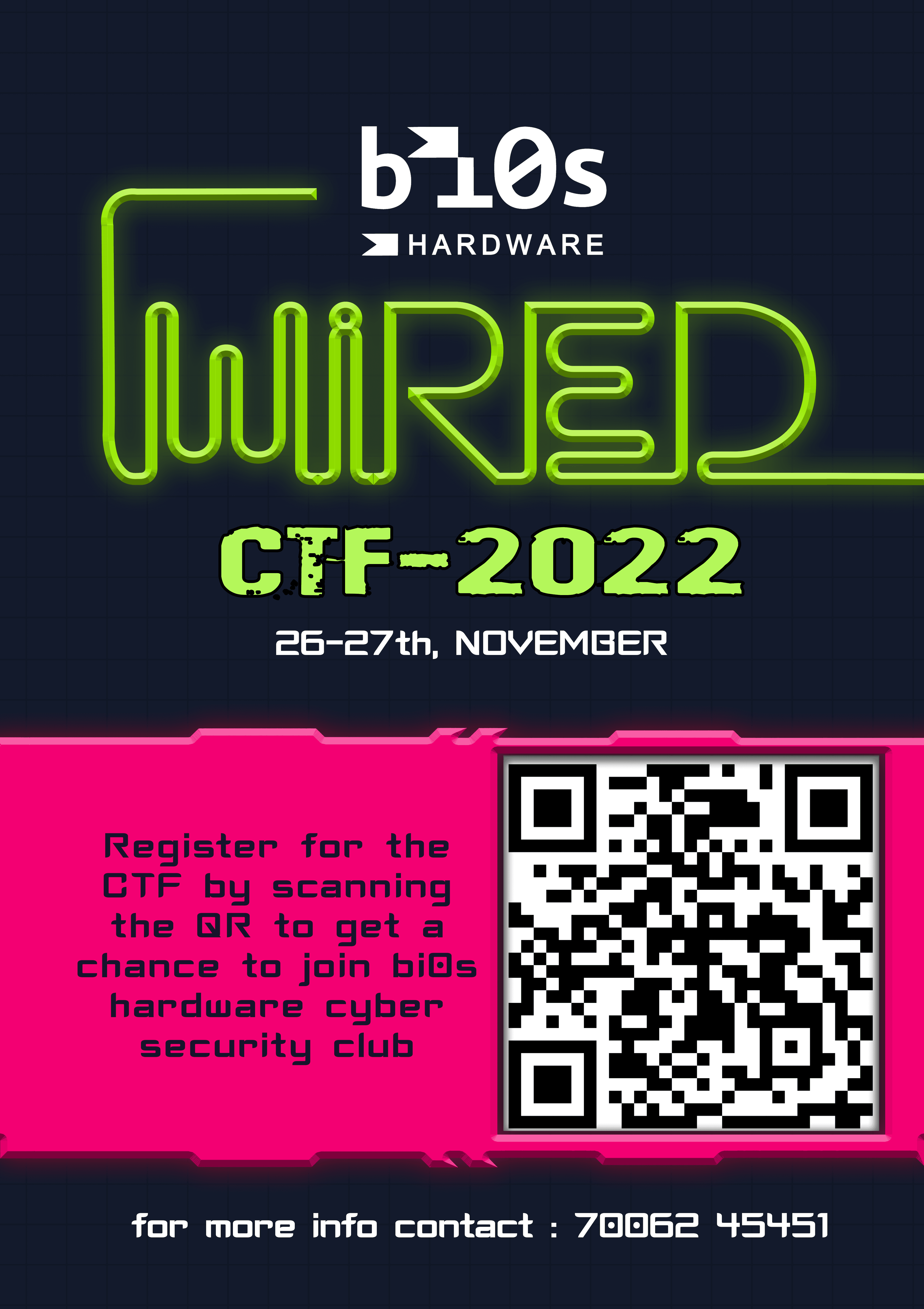
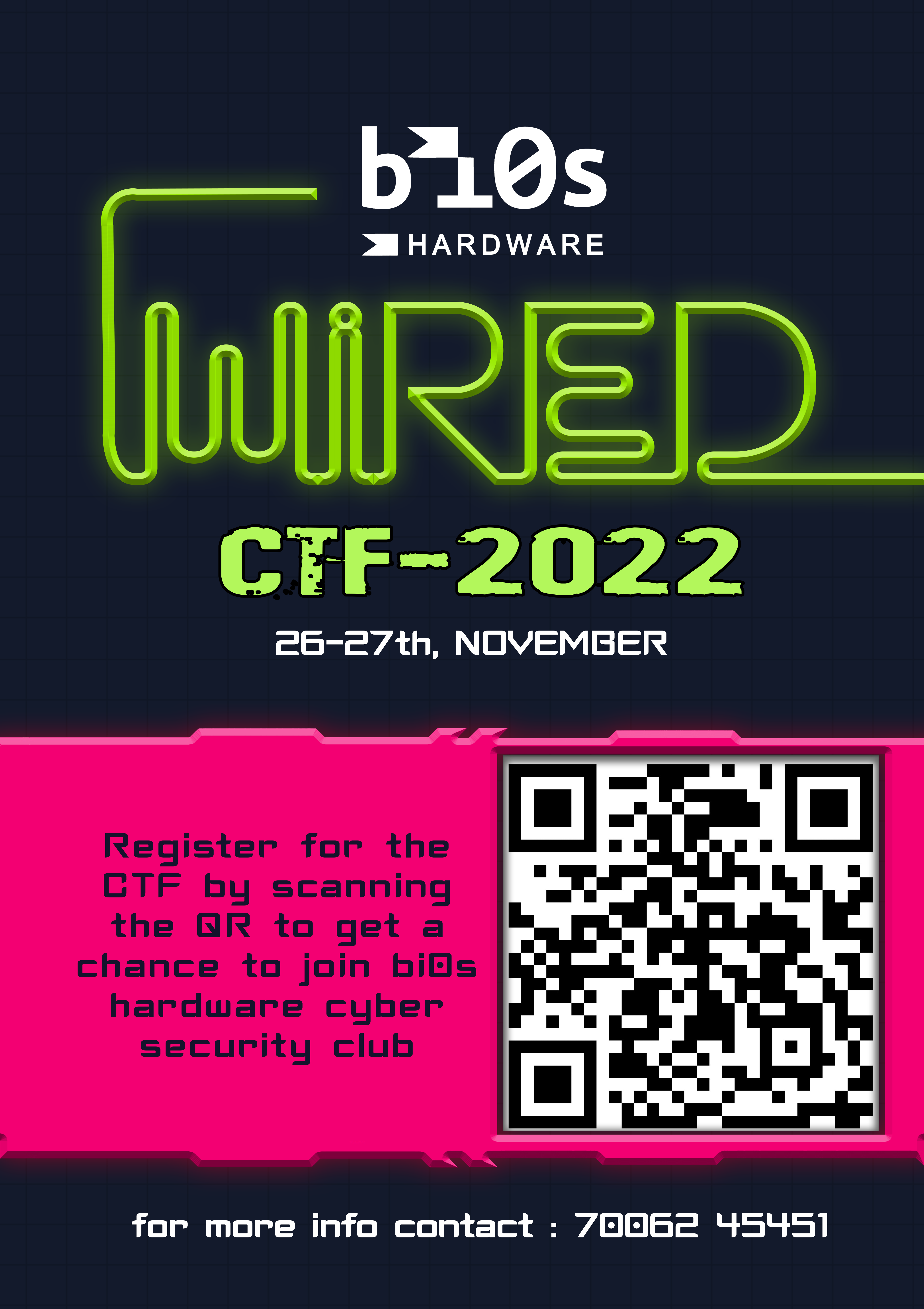
Security events need artwork that feels like the scene without becoming unreadable noise. The hardware hacking workshop poster has one job: get people into the room.

| Piece | The one job |
|---|---|
| WiRED CTF | Give a competition an identity people remember |
| Hardware Hacking workshop | Get people into the room |
Festivals and Culture
Festival posters carry a lot of colour and emotion, which makes hierarchy harder, not easier. The work is in keeping that colour in a quiet structure so the date and place still read first.

| Piece | The approach |
|---|---|
| Trip South Festival | Portrait, type, and colour locked into one vertical system |
| Ugadi | Festival colour held in a quiet hierarchy |
| Christmas Calendar | The grid is the illustration |
| Michael Jackson tribute | One figure, a loud crop, and type that stays out of the silhouette |
Brands and Social
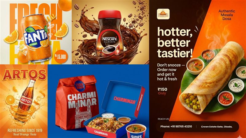
Social creatives are read in a second, on a phone, mid-scroll. The rule is the same as any poster, just faster: the product is the hero and the offer reads at a glance.

| Piece | Format | The approach |
|---|---|---|
| Food combo | Square social post | The meal is the hero; the offer reads in a glance |
| Product campaign | Campaign board | A series of ads composed as one system |
| Entrance exam campaign | Poster | Dates, hierarchy, and one call to action |
The Method
| Step | Question |
|---|---|
| 1. One job | What is the single thing this piece must make someone do? |
| 2. Hierarchy | What must be read first, second, and third? |
| 3. Identity | What does this event or brand already look like? |
| 4. Subject | What is the image, and how does type stay out of its way? |
| 5. Format | Where will it be seen: a wall, a feed, a screen? |