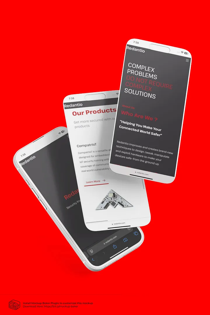
The challenge
Six hours. One designer. Zero room for error. Redantio was a cybersecurity brand aimed at a very specific audience of bureaucrats, and it needed a complete identity and web presence — brand, interface, and experience — in a single sprint. A real-world simulation of startup pressure: limited resources, an impossible deadline, and a vision that needed translating into pixels fast.
The process
- Wireframes first — bare-bones black-and-white boxes to lock down layout and flow without overthinking.
- Color check — tested contrast, accessibility, and emotional tone. Vibrant reds (#C10206, #A50113) over soft grays: bold, urgent, memorable.
- Micro animations — AOS.js scroll reveals, hover feedback on buttons and cards, subtle input highlights. Seasoning, not the meal.
- Type system — Poppins for a clean base, Kanit for bold headers, Pathway Extreme for flair.
What I learned
Built with Figma, Tailwind CSS, and raw HTML/CSS/JS — speed over polish. The takeaway: great design isn't born in a vacuum, it's born in constraints. Time pressure didn't kill creativity; it forced it to grow in new directions. The full breakdown is in the case study.